Tag Archives: finance
Portfolio Risk – Diversification and Correlation
This article is a visualization of a portfolio of two assets where we see how portfolio return and risk changes as the weight changes and the correlation between the two underlying assets changes.
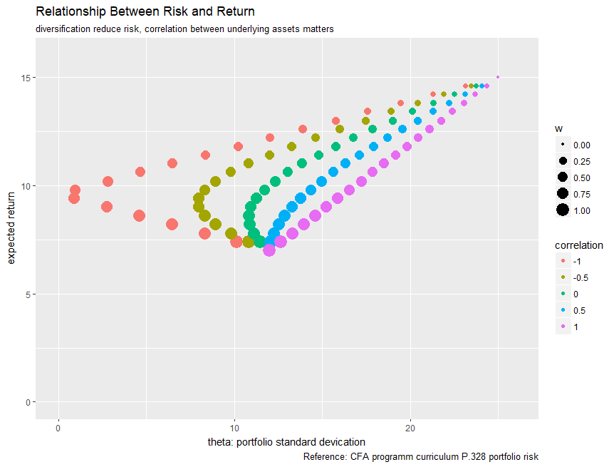
This is a very typical risk return plot where the horizontal axis represent the risk – standard deviation of the portfolio where the vertical axis represent the expected return of the portfolio. All the data points are color coded by the correlation between the two assets (eg. purple +1, 100% positive correlated). It might not be that obvious, but I set the size of each data point to be the weight for asset 1 where the biggest represent all the capital is allocated to the asset one, and vice versa.
Here is a screenshot of the R code to generate the graph above.

The key takeaway is that given same expected return, you want to diversify your portfolio in a way where underlying assets are more negatively correlated to each other to reduce the risk. This might sounds magical but the math did serve the purpose of proof. However, it is easier to say than doing, if you have an asset that has a good return, but might correlate positively which you will like to replace, in real life, it will be hard to find some alternative with the same return because if a stock is negatively correlated to what you already have, it probably has a subpar return rate (hedging is another thing if that is what you want to achieve).
