R – aov Plus TukeyHSD to quickly identify difference between categories

Say you have a column which contains categorical variables / factors. Then How can we quickly and confidently identify the differences between different categories?

A very commonly used dataset ‘mpg’ from the package ‘ggplot2’ contains some categorical variables that could easily get started. There is a column in mpg called ‘cty’ which is the miles per gallon for a car while driving in city. And also another column ‘manufacturer’ which contain categorical variable the different manufacturers.

library(ggplot2)
data(mpg)
bymedian = with(mpg, reorder(manufacturer, -cty, median))
boxplot(cty ~ bymedian, data = mpg, varwidth = TRUE)

result = aov(formula = mpg$cty ~ as.factor(mpg$manufacturer))
TukeyHSD(result)

aovmpgmanufacturer

mpgboxplotmanufacturer

Francis Galton: relation between the heights of children and the height of their parents.

Background Story:

Sir Francis Galton, who is the cousin of Charles Darwin was an English Victoria polymath, eugenicist and statistician. He proved the linear combination of normal distribution is still normal distribution and he is also,the inventor of the triangle device – quincunx. Here, we will talk about the research that he has implemented long time ago(1885).

library(UsingR)
data(galton)
par(mfrow=c(1,1))
plot(galton$parent, galton$child, pch=19, col=”blue”)
m <- lm(galton$child ~ galton$parent)
lines(galton$parent, m$fitted, col=”red”, lwd=3)

Image

R – Interesting Density Plot

I always use histogram command to look at the distribution of a uni-variable data. And to distinguish the difference of distribution of a subgroup from the whole, I usually do two or more plots with the same scale.

data(mtcars)
par(mfrow=c(4,1))
hist(mtcars$mpg, breaks=20, col=8, xlim=c(10, 40), main=’total’)
hist(mtcars$mpg[mtcars$cyl==4], breaks=20, col=3, xlim=c(10, 40), main=’V4′)
hist(mtcars$mpg[mtcars$cyl==6], breaks=20, col=4, xlim=c(10, 40), main=’V6′)
hist(mtcars$mpg[mtcars$cyl==8], breaks=20, col=5, xlim=c(10, 40), main=’V8′)

Image

You can clearly read the information that the more cylinders you have in your car, the more gas it will take in general, of course, a lower MPG (Miles Per Gallon).

Also, you can use the density plot to see the distribution of data for each cylinder and plot them all together in one plot. I also attached a boxplot using factor which give a better picture of what is going on. By the way, the varwidth=TRUE will set the width of the box as the number of records in that box. In this case, you will see we have almost same amount of records inside each category.

dens = density(mtcars$mpg)
dens.4 = density(mtcars$mpg[mtcars$cyl==4])
dens.6 = density(mtcars$mpg[mtcars$cyl==6])
dens.8 = density(mtcars$mpg[mtcars$cyl==8])
par(mfrow=c(2,1))
plot(dens, lwd=4, col=8, ylim=c(0, 0.25), main=”Density Plot of MPG”)
lines(dens.4, lwd=3, col=3)
lines(dens.6, lwd=3, col=4)
lines(dens.8, lwd=3, col=5)
boxplot(mtcars$mpg ~ as.factor(mtcars$cyl), varwidth=TRUE, col=’orange’, main=”Boxplot of MPG vs Number of Cylinders”)

densityboxplotmtcarsmpg

Contents cited from Coursera class Data Analysis from Johns Hopkins University by Jeff Leek.  The dataset that Jeff was working with comes from the package kernlab (kernal based machine learning lab).

library(kernlab); data(spam); set.seed(3435);

trainIndicator = rbinom(4601, size=1, prob=0.5)

table(trainIndicator)

0 1
2314 2287

# table command here is called: Cross Tabulation and Table Creation which comes very handy

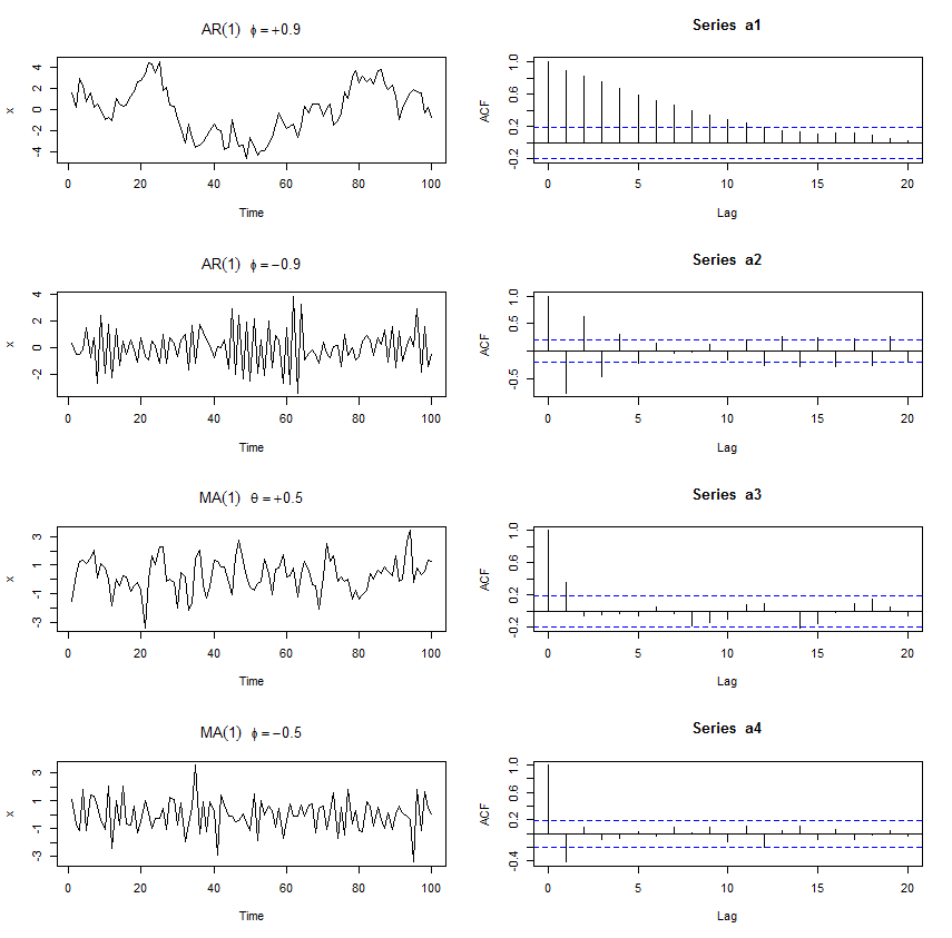
1. Look at the training set with the commands: names(data), head(data), table(data$col)

2. Plot

plot(log10(trainSpam$capitalAve+1) ~ trainSpam$type)spamplot

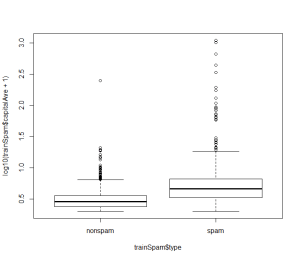
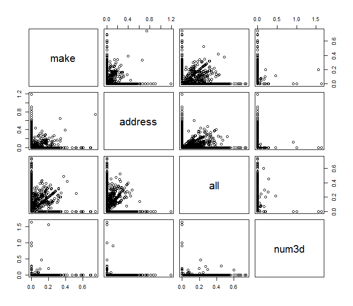
# you can also use pairs command here

plot(log10(trainSpam[,1:4]+1)) pairplot

plot(hclust(dist(t(log10(trainSpam[, 1:57]+1)))))  clusterDendrogram


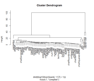
# the code below demonstrate a basic process for statistical prediction/modeling

trainSpam$numType <- as.numeric(trainSpam$type) – 1
costFunction <- function(x,y) {sum(x!=(y>0.5))}
cvError = rep(NA, 55)
library(boot)

for(i in 1:55){
lmFormula = as.formula(paste(“numType~”, names(trainSpam)[i], sep=””))
glmFit = glm(lmFormula, family=”binomial”, data=trainSpam)
cvError[i] <- cv.glm(trainSpam, glmFit, costFunction, 2)$delta[2]
}

# measure of uncertainty

predictionModel <- glm(numType ~ charDollar, family =”binomial”, data=trainSpam)
predictionTest <- predict(predictionModel, testSpam)
predictedSpam <- rep(“nonspam”, dim(testSpam)[1])
predictedSpam[predictionModel$fitted > 0.5] = “spam”
table(predictedSpam, testSpam$type)

– predictedSpam nonspam spam
– nonspam 1348 398
– spam 81 481

(We can see the spam classifier we built only using the dollar sign did a pretty good job for non spam emails but for spam emails, the output turned out to be half and half)

And the error rate is about 22%


STATS – the Turning Point Test

Say, you have a time series object that you want to work with. You might want to check if the time series happens to be generated by white noise only, this might happen not only during the interview but also in real life sometime.

If you have three contiguous time points, assuming they are of different values. Then there are 6 permutations to order them.  And four of them form a turning point (PEAK/PIT).

The expectation of number of turning points for a time series generated by white noise is then 2/3 * n, and actually they falls into a normal distribution where the variance is 8/45*n.

So your 5% confidence test should check if the number of turning points is within the range of: 2/3*n +- 1.96*sqrt(8/45*n):

require(pastecs)
data <- rnorm(10000, 0, 1)
plot(data)
limit <- function(n){
print(2/3 * n)
print(2/3 * n – 1.96 * sqrt(8/45 * n))
print(2/3 * n + 1.96 * sqrt(8/45 * n))
}
turnpoints(data)
limit(10000)

OUTPUT

> turnpoints(data)

Turning points for: data nbr observations : 10000 nbr ex-aequos : 0 nbr

turning points: 6657 (first point is a peak) E(p) = 6665.333 Var(p) = 1777.456 (theoretical)

> limit(10000) [1] 6666.667 [1] 6584.026 [1] 6749.308

You can clearly see that the fake time series does actually have 6657 turning points and it has been tested falls into our “BLACK LIST INTERVAL”!

STATS – How a Auto Regressive Series and Moving Average Series Look Like

ACF of AR(1) is phi^h

ACF of MV(1) is theta/(1+theta^2) only for h=1 and 0 when h>1

——————————————————————————————–

par(mfrow=c(4,2))
a1 <- arima.sim(list(order=c(1,0,0), ar=0.9), n=100)
plot(a1, ylab=”x”, main=(expression(AR(1)~~~phi==+.9)))
acf(a1)
a2 <- arima.sim(list(order=c(1,0,0), ar=-0.9), n=100)
plot(a2, ylab=”x”, main=(expression(AR(1)~~~phi==-.9)))
acf(a2)
a3 <- arima.sim(list(order=c(0,0,1), ma=0.5), n=100)
plot(a3, ylab=”x”, main=(expression(MA(1)~~~theta==+.5)))
acf(a3)
a4 <- arima.sim(list(order=c(0,0,1), ma=-0.5), n=100)
plot(a4, ylab=”x”, main=(expression(MA(1)~~~phi==-.5)))
acf(a4)


ARMA

R Base Functions that You Never Use

I happen to find a list of all the R base functions, then I cannot help going through some of them. To satisfy my pride, I decided to look in the back order.

1. yinch – xinch

(Move the point in the unit of inch while plotting)

2. edit/vi/emacs/xemacs/xedit

testData <- edit(data)

3. getwd()/write()/unlink()

get the current working directory, write matrix to the working directory, delete the file

4. file()/file_test()/file.access()/file.remove()/file.copy()/file.exist()/file.info()/file.append()/file.symlink()/file.link()/file.path()/file.show()

… all the low level interface to the computer’s file system