I always use histogram command to look at the distribution of a uni-variable data. And to distinguish the difference of distribution of a subgroup from the whole, I usually do two or more plots with the same scale.
data(mtcars)
par(mfrow=c(4,1))
hist(mtcars$mpg, breaks=20, col=8, xlim=c(10, 40), main=’total’)
hist(mtcars$mpg[mtcars$cyl==4], breaks=20, col=3, xlim=c(10, 40), main=’V4′)
hist(mtcars$mpg[mtcars$cyl==6], breaks=20, col=4, xlim=c(10, 40), main=’V6′)
hist(mtcars$mpg[mtcars$cyl==8], breaks=20, col=5, xlim=c(10, 40), main=’V8′)

You can clearly read the information that the more cylinders you have in your car, the more gas it will take in general, of course, a lower MPG (Miles Per Gallon).
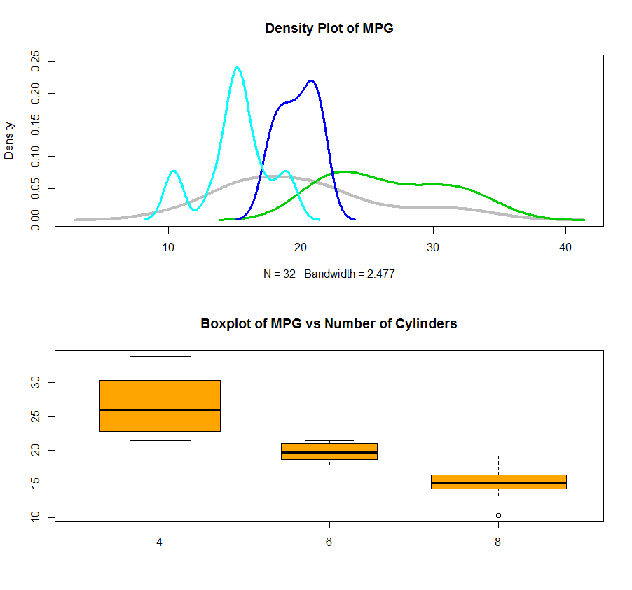
Also, you can use the density plot to see the distribution of data for each cylinder and plot them all together in one plot. I also attached a boxplot using factor which give a better picture of what is going on. By the way, the varwidth=TRUE will set the width of the box as the number of records in that box. In this case, you will see we have almost same amount of records inside each category.
dens = density(mtcars$mpg)
dens.4 = density(mtcars$mpg[mtcars$cyl==4])
dens.6 = density(mtcars$mpg[mtcars$cyl==6])
dens.8 = density(mtcars$mpg[mtcars$cyl==8])
par(mfrow=c(2,1))
plot(dens, lwd=4, col=8, ylim=c(0, 0.25), main=”Density Plot of MPG”)
lines(dens.4, lwd=3, col=3)
lines(dens.6, lwd=3, col=4)
lines(dens.8, lwd=3, col=5)
boxplot(mtcars$mpg ~ as.factor(mtcars$cyl), varwidth=TRUE, col=’orange’, main=”Boxplot of MPG vs Number of Cylinders”)