
Category Uncategorized
R – Rman the way to be a man of R

Python – Why Python is slow
Here is post that caught my eye.
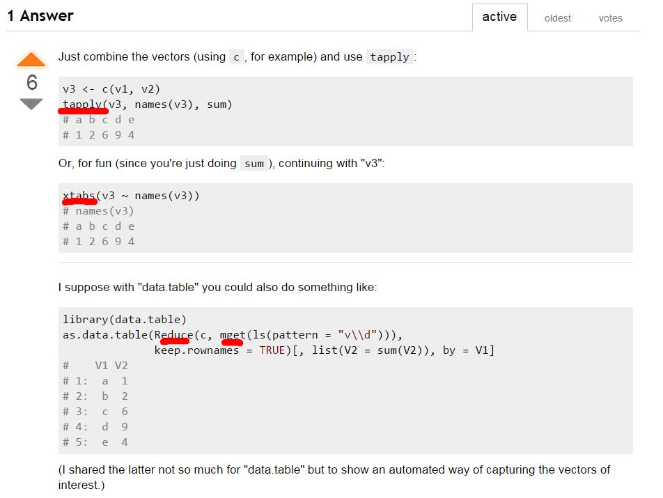
R – tapply
Somehow I have read a post long time ago showing that the importance of understanding all the different types of *pply, like apply, lapply, tapply, vapply..etc. Today, I watched the awesomeness of tapply ‘LIVE’! Also, I really think the people who understand R writes code in an absolute different style from people’s “intuition”. Here is the Stackoverflow post that I got totally blown away.
Fiddler Web Debugger – Windows Only
Get Sick of the built-in inspect element tool of Chrome, check out this software, which is windows only for now.
Arduino – Most “Effective” Morning Alarm – Gesture Unlock
This is a project built by my girlfriend. She bought most of the staff from Sparkfun, where I think the gesture sensor is really cool. However, that picky sensor only works at 3.3V level which forces her to wipe the dust off my ancient level converter.
Congratulations and good job baby!

Curious how this transistor can do this magic?
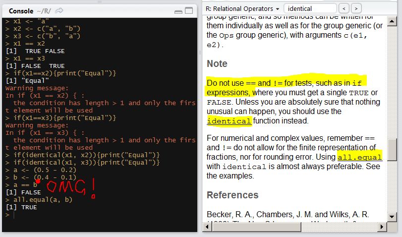
R – How dare you use “==” in if statement
There are usually so many places in each language that just don’t make that much sense but so easy for an inexperienced programmer to adopt and take for granted.
“==” in R is such a thing. I came from a Python programming background and I take for granted that to use “==” in an if statement whenever comparing two objects based on value.
However, in R, I just noticed that even in the documentation of “==”, they clearly write down a misunderstanding of “==” will lead to a disaster.
R – ifelse as a function
Today I was working on a problem analyzing inventory movement. Like calculating inventory turns, inventory replenishment cycle, average inventory value ..etc. However, if you are not familiar with those supply chain terms. You can simply think it as a time series problem where you are supposed to calculate the sum of the total drop and the sum of the total increase.
Usually you are supposed to see a saw shape time series problem, where the seller bought a fair amount of inventory and put on the shelf, then as days go by, people buy product from the seller at random quantity, which lead the inventory value decrease. Then in the perfect scenario, seller noticed that the on-hand quantity is below a certain threshold(safety stock), then the seller will send out another big order to the supplier to buy more of those products before it run out of stock. Sometimes, the supply chain is not well optimized which end up with a situation where there is not enough supply to meet the demand. ie. leaving money on the table.
However from the perspective of a data scientist, you need to get your hands dirty and deal directly with numbers. The data is not clean, sometimes, you get a customer product return which should not be counted as a transaction plus a inventory replenishment, sometimes, you might get a inventory typo in the data which is an absolute outlier.
In this case, you probably need to first, remove some outliers and then figure out a way dealing with missing values and in the end, calculate those business inventory metrics.
Today, I came across a very handy function in R which makes it so easy to mutate a column value based on certain condition, which doesn’t require a complete loop with nested if statements.
x <- rep(10:2, 4)
> x
[1] 10 9 8 7 6 5 4 3 2 1000 9 8 7 6 5 4 3 2 10 9 8 7 6 5 4 3 2 10
[29] 9 8 7 6 5 4 3 2
x[10] <- 1000 # outlier
x_limit <- 5 * median(x)
x_new <- ifelse(x < x_limit, x, NA)
# Here you successfully identify outliers which has the definition of being greater than 10 times the median..
# From now on, you can use some built-in methods to deal with missing values like, locf (last observation carrier forward)
# or nocb (next observation carrier backward) or interpolate the missing values based on both sides (na.approx)..etc
> x_new
[1] 10 9 8 7 6 5 4 3 2 NA 9 8 7 6 5 4 3 2 10 9 8 7 6 5 4 3 2 10 9 8 7 6 5 4 3 2
> zoo::na.locf(x_new)
[1] 10 9 8 7 6 5 4 3 2 2 9 8 7 6 5 4 3 2 10 9 8 7 6 5 4 3 2 10 9 8 7 6 5 4 3 2
After Effects: Andrew Kramer Keynote Speech on Adobe Conference

Data scientists need to communicate really well literally and figuratively. You might pay attention to how you frame your words or how you present the info beyond simply words – like a picture, like a chart, or even a video. The reason that people are usually into plots instead of videos is simply because it is easy to make plots! You can simply use ggplot2 to make awesome static plots. Then people become picky and they want to make plots interactive, then it came in rCharts, highcharts or even d3.js. HOWEVER, if you have a team developing a data product, and how the output of the project is really beyond people’s intuition. Say you try to make better marketing decisions based on historical data. Then you might think about using some expertise to summarize your project into a few minutes kickass video that really catch people’s eyeball. Also, the output of data science group is usually directly to the executive who will have almost zero experience in data or advance math. But, you really need to make an attractive way to infuse your understanding into their new year roadmap and decision making. Don’t try to let them figure out what should be the take away, repeat to them again and again what they should take away. Touch, Convince and Infuse.
Andrew Kramer is the founder of “videocopilot” which really blowed me away when I saw the quality of the videos he has made on his website. And what is more, He has some decent tutorials showing you how to make awesome videos.
Path of a data scientist
This is a super fun picture that I came across from R-bloggers.

