R – DTW(Dynamic Time Warping) Pattern Matching

This post originates from this Stackoverflow question. It is the first time I ever came across the term “Dynamic Time Warping” and it turned out it is a really straight forward concept in the end after reading this introduction from Macquarie University.

In a short sentence, it will to match the pattern between two series by finding the best consistent path.

idx<-seq(0,6.28,len=100);
query<-sin(idx)+runif(100)/10;
template<-cos(idx)
library(dtw);
plot(dtw(query,template,keep=TRUE),type=”threeway”)
plot(dtw(query,template,keep=TRUE,step=rabinerJuangStepPattern(6,”c”)),type=”twoway”,offset=-2);

dtw_threeway


For example, lets start with the Query data, it starts at value 0, and Reference data start with 1. Then we say they are not good match. We need to keep search down the Query sequence until we hit the value closest to 1, which is basically at index 30 at the Query index. That explains why the alignment start flat horizontally. Actually, it turns out from then on, the query data and the reference data lines up pretty well. And that explains why the alignment plot is almost perfect diagonal (it should be perfect diagonal if you compare one series to itself). Then after the query data reaches value 0 at index 100. The path need to end at top right corner. And that is why there is also a vertical line in the end.

dtw_twoway_rabinerJuangStepPattern


After all these interesting math games and plots, we might need to spend some time figuring out how should that be applied to our data science life, right? Believe or not, there is an article from the Journal of Statistical Software by Toni Giorgio, who is the author is this package dtw.

So you basically need to understand what index1 and index2 mean and then building a mapping function using those two vectors to map the input/query data to the reference/template. Then you can scale the input data in whatever way you want.

Here is a visualized way of the optimal path:

dtw_optimalpath_heatmap


R – d3 make graph plot in one line using d3network

library(d3Network)
Source <- c(“A”, “A”, “A”, “A”, “B”, “B”, “C”, “C”, “D”)
Target <- c(“B”, “C”, “D”, “J”, “E”, “F”, “G”, “H”, “I”)
NetworkData <- data.frame(Source, Target)
# Create graph
d <- d3SimpleNetwork(NetworkData, height = 300, width = 700, fontsize = 15)

Screen Shot 2014-09-08 at 5.08.48 PM

Will generate a html file that contains all the data. You can open up the file in your browser and you will see an interactive plot with a few nodes.
It is also a lot of fun to drag and yank the node here and there.

It is also really amazing that how much data this package can handle, here is a post from R-bloggers that show you a few graphs with more data points.

Screen Shot 2014-09-08 at 5.07.58 PM

R – DPUT and DGET

Story starts from this Stackoverflow question.

Mrflick gave an answer to help the OP drew the plot using ggplot2, and I was curious that the way how he came up with data frame looks so unique. Honestly, I have never seen anyone so far using the structure function with nested list object to create a data frame. Then I suggested to him using `read.table` to import the data directly into R, like this.

library(plyr)
library(reshape2)

datatext=”
8192 2 1 1 1
65536 10 5 4 4
1048576 81 60 63 52
8388608 675 555 572 464
16777216 1334 1124 1171 953
33554432 2780 2348 2438 2014
67108864 5853 5229 4957 4238
134217728 12437 10303 10521 8921

mydata <- read.table(text=datatext, col.names=c(“size”, “v1”, “v2”, “v3”, “v4”))

Clearly, I guess you should never tell a guy with 28K stackoverflow credits what is the right way to read in data. 🙂 I guess when he read in the data, it is probably in a much smarted way than I imagine, but clearly, he was using the `dput` and `dget` function because he is SHARING CODE.

So basically, you can use dput to “Writes an ASCII text representation of an R object to a file or connection, or uses one to recreate the object.”, say you have a small data frame `mtcars` that you want to send to your coworker through Skype.

You can just type `dput(mtcars)` and it will print a long string to the standard output and you can just cp to Skype, then they can read in simply by copy and paste the string to reconstruct the object in one line by running `data <- <skypestring>`.  This not only works for data but also for functions.

`dget` is only used to read from a file which contains the output from dput.

R – DoseFinding

Today, I got to know this library `DoseFinding` and it actually is so powerful that I think I probably will use this library for modeling in the future.

library(DoseFinding)
library(gridExtra)
data(biom)
fitemax <- fitMod(dose, resp, data=biom, model=”emax”)
p1 <- plot(fitemax)
fitlinearlog <- fitMod(dose, resp, data=biom, model=”linlog”)
p2 <- plot(fitlinearlog)
fitlinear <- fitMod(dose, resp, data=biom, model=”linear”)
p3 <- plot(fitlinear)
fitquadratic <- fitMod(dose, resp, data=biom, model=”quadratic”)
p4 <- plot(fitquadratic)
fitexponential <- fitMod(dose, resp, data=biom, model=”exponential”)
p5 <- plot(fitexponential)
fitlogistic <- fitMod(dose, resp, data=biom, model=”logistic”)
p6 <- plot(fitlogistic)
grid.arrange(p1, p2, p3, p4, p5, p6)

stackoverflow_25677200

Let’s take a closer look at the fitMod function, there are so many commonly used models built in this model.

There are so many arguments that you can pass to the function fitMod, and there is a parameter `bnds`, which will define the bounds for non-linear parameters.


Node.js – Web Scraping Using Cheerio

This is a fantastic video from Smitha Milli, which will help you get started with web scraping using Node.js.

Also, there are a few interesting projects that might need to check out in the future.

1. Nokogiri in Ruby

2. Request and Cheerio in Node.js

3. pjscrape Javascript (using PhantomJS and jQuery)

I also modified her code a little bit and pushed my own code to my github account. It will save the raw html along with other interesting attributes to a plain file in json format. And people can extract the part they want in the future.

R – Lattice, Trellis another awesome framework for data visualization.

This whole post originates from this stackoverflow question. The original poster(OP) was having a hard time putting multiple `plots` into the same canvas. It looks like he was using the base plot function and I assumed the par(mfrow) will be enough in that case. However, it turned out this is a way more interesting question than I first realized and here are all the `aha`s.

He was using a library called DoseFinding , which is

a package provides functions for the design and analysis of does-finding experiments(for example, pharmaceutical Phase II clinical trials).

In there you can use the base plot function to plot the return object from the function `fitMod` (the does response model). You can see the return class of fitMod is called “DRMod” (drug response model) and the plot class is called “Trellis”.

Actually, Trellis is a whole visualization framework developed by the Bell Lab and AT&T Research.  Here is another post to understand post to give you a basic understanding of lattice and trellis.

I have working working with the base plot functions like boxplot, hist, plot.. and also ggplot2 from Hadley Wickham for a while, and I am surprised to find out how easy it is to use lattice package to draw plots taking multiple variables into consideration.

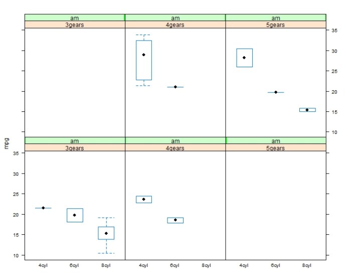
multivariates_lattice

bwplot( mpg ~ cyl.f | gear.f * am)

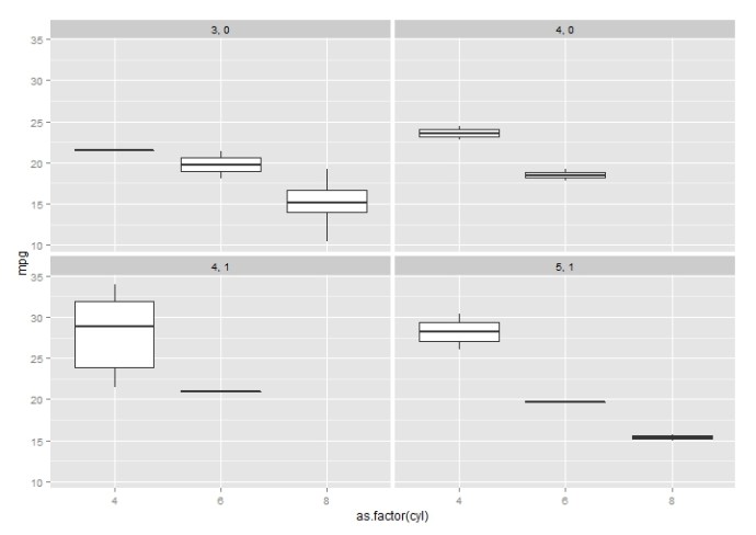
multivariates_ggplot2

ggplot(data=mtcars, aes(x=as.factor(cyl), y=mpg)) + geom_boxplot() + facet_wrap(~gear + am)

There are also so many different plot methods in lattice, which you can spend more time exploring.

Vincent – A Python Library to build d3 quality plot

Vega is a visualization grammar developed by the folks from Trifacta(some history). You can have a brief idea of the idea of Vega in just one minute going to this online editor, which will map the json syntax to its corresponding virtualization. What is more, the community has also developed Python package Vincent to make Python plot beautifulsoup d3 quality graphs with Vega running behind the scene.

I installed Anaconda Python on my Ubuntu box since pandas is a dependency for Vincent, which Anaconda ships with pandas. There are hundreds of warnings while I was doing `sudo pip install vincent` and it also took me a 10+ minutes pausing now and then, in the end, it will finish, FYI.

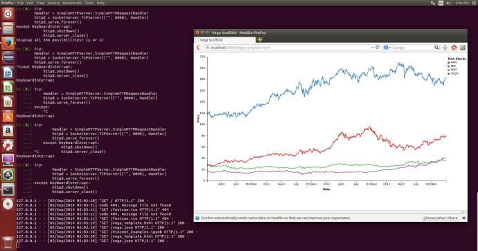
My first impression of Vincent is it is actually not as awesome and friendly as rCharts in R. And after tinkering about for a while, I did not figure out how to do that in iPython notebook and instead generated the vega template and the vega.json to have a plot looks like below. It looks pretty slick but there is no hovering over and those interactive features that I assume should be delivered. And I still think it will prefer rCharts over Vincent unless one day that I have to develop it in the Python environment. iPython Notebook + Vincent + Flask? maybe …
But at this moment, I like Shiny + rCharts + ggplot2!

vincent_lineplot