Category Uncategorized
Finance –
R – Something about Clustering
R – Interview with Yihui Xie – Author of Knitr
R – RGL (openGL) A package to make 3D easy
Here is a paper that describes rgl package in detail. And here I will just attach some code to show how to install the package and quickly plot a few proof of concept plots in 3D and it is really a fun experience to draw the plot yourself and interact with it, rotate, flip, zoom in zoom out…etc.
> library(“rgl”)
> ?rgl.spheres
> open3d()
> spheres3d(rnorm(10), rnorm(10), rnorm(10), radius=runif(10), color=rainbow(10))
> rgl.open()
> rgl.points(rnorm(1000), rnorm(1000), rnorm(1000), color=heat.colors(1000))
If you are using Mac, you probably need to have X11 (XQuartz) pre-installed and here are the outputs from the commands above, it won’t be printed to the Plots/Viewer panel if you are using RStudio, and it will be a new window for each open3d() command.

R- Selenium As Handy As Usual
The package RSelenium is actually developed a while back. 2014-05-24. And it provides an API as easy as the API in Python. So one can use Selenium to test his/her Shiny app or do webscraping using Selenium in R!
R – Understanding how to pass arguments to functions.
Start from this stackoverflow question.
When you pass … (three dots) to a function, you it will be a named list that you can retrieve the argument value by using list(…)$argument name, also ..n (two dots followed by a integer) will retrieve the argument by order. ..2 will retrieve the second one and ..1 will retrieve the first one.
R – DTW(Dynamic Time Warping) Pattern Matching
This post originates from this Stackoverflow question. It is the first time I ever came across the term “Dynamic Time Warping” and it turned out it is a really straight forward concept in the end after reading this introduction from Macquarie University.
In a short sentence, it will to match the pattern between two series by finding the best consistent path.
idx<-seq(0,6.28,len=100);
query<-sin(idx)+runif(100)/10;
template<-cos(idx)
library(dtw);
plot(dtw(query,template,keep=TRUE),type=”threeway”)
plot(dtw(query,template,keep=TRUE,step=rabinerJuangStepPattern(6,”c”)),type=”twoway”,offset=-2);

For example, lets start with the Query data, it starts at value 0, and Reference data start with 1. Then we say they are not good match. We need to keep search down the Query sequence until we hit the value closest to 1, which is basically at index 30 at the Query index. That explains why the alignment start flat horizontally. Actually, it turns out from then on, the query data and the reference data lines up pretty well. And that explains why the alignment plot is almost perfect diagonal (it should be perfect diagonal if you compare one series to itself). Then after the query data reaches value 0 at index 100. The path need to end at top right corner. And that is why there is also a vertical line in the end.

After all these interesting math games and plots, we might need to spend some time figuring out how should that be applied to our data science life, right? Believe or not, there is an article from the Journal of Statistical Software by Toni Giorgio, who is the author is this package dtw.
So you basically need to understand what index1 and index2 mean and then building a mapping function using those two vectors to map the input/query data to the reference/template. Then you can scale the input data in whatever way you want.
Here is a visualized way of the optimal path:

R – d3 make graph plot in one line using d3network
library(d3Network)
Source <- c(“A”, “A”, “A”, “A”, “B”, “B”, “C”, “C”, “D”)
Target <- c(“B”, “C”, “D”, “J”, “E”, “F”, “G”, “H”, “I”)
NetworkData <- data.frame(Source, Target)
# Create graph
d <- d3SimpleNetwork(NetworkData, height = 300, width = 700, fontsize = 15)
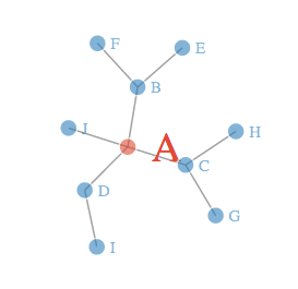
Will generate a html file that contains all the data. You can open up the file in your browser and you will see an interactive plot with a few nodes.
It is also a lot of fun to drag and yank the node here and there.
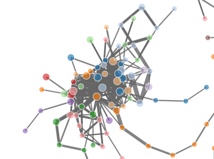
It is also really amazing that how much data this package can handle, here is a post from R-bloggers that show you a few graphs with more data points.